
Dollar Street - Gapminder
|
|

What is Dollar Street? - You are going to spend two lessons exploring the excellent Dollar Street website. To access it, you can click the link above.
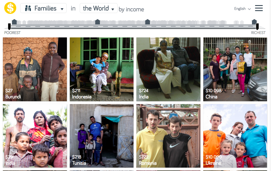
Imagine the world as a street ordered by income. Everyone lives somewhere on the street. The poorest lives to the left and the richest to the right. Everybody else live somewhere in between. You are welcome to visit all homes on Dollar Street!
Dollar Street documents the lives of over 264 homes in 50 countries so far, and the list is growing. In each home the photographer spends a day taking photos of up to 135 objects, like the family’s toothbrushes or favorite pair of shoes. All photos are then tagged (household function, family name and income).
Let's Visit - When you access the site, it will order the houses visited in terms of the income. Poorest on the left, middle incomes in the middle and richest on the right. Spend 10 minutes clicking on different people's homes and have a look around and read up on the family in question. You might notice that there are some countries in places you perhaps wouldn't expect.
Keep Visiting - Now go back to the homepage, and click on the first drop down menu. Look at the third column, 'All Topics' and have a look through the list of the items photographed. Click on 'Tables with Food' and see how diets and varieties of food vary from household to household and according to wealth.
Task 1 - Which 'factors' best show level of development?
You aim is to choose TWO FACTORS from that 'All Topics' list that YOU think show how that factor is influenced by the amount of money that people have.
Select the first factor and then carefully choose one image from each column to show the four different levels of development (you might want to choose the poorest, the richest and two in between).
Take a note of the name of the country and the family average monthly wealth. Then copy each of the photos into the worksheet below. Once that is done, write down a brief summary of the change in the 'Factor' as wealth increases.

Task 2 - Do It Again!
Now repeat the steps in Task 1 for your other factor from the list. Use the template above again for these tasks.
Task 3 - Development Disparities Within A Country
So, you have seen that some countries come up in different columns meaning that wealth is very varied within that country.
One big weakness of using development indicators such as GDP Per Capita, Literacy Rate or Life Expectancy is that they don't show regional disparities (that means disparities within a country). It is a well known fact that the north of Italy is much more wealthy than the south, for example.
A good example is China, a large country with the second highest population on earth. Click on China. Check out the massive range of development!
Choose, two countries that have a large disparity in the level of development within by choosing a family from each of the four development columns. You can use China if you want! You won't find much difference here for smaller countries like Spain or France, and should focus on countries that have large populations.
Read about the family and then paste their image into the worksheet below followed by a brief description of them and why they are at that particular level.
Underneath, in the last space available, write which factors change the most within that country as you move from the poorest to the richest (e.g. quality of the car, amount of food etc.).
Task 4 - Do It Again!
Now repeat the steps from Task 3 for your two remaining countries. Use the template above again for these tasks.