The 'Dream Team'
Who is the Sword Swallowing Swedish Professor?
Start the video at 08:15
Start the video at 08:15
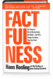
The seemingly crazy guy you have just seen at the end of the video above is called Professor Hans Rosling. Using your excellent research skills, I would like you to find out a bit more about him and complete the worksheet below. Please also do the same for both his son (Ola) and daughter-in-law (Anna).
How to be more 'Factful'
To complete this work, you will be using the worksheet below. There is the PDF version that can be printed out or the Word version that can be completed on the computer. All the information you need is on there apart from if you are using a printed version, you will need this link to complete the section entitled 'Mountains Out of Molehills'.
The Amazing Geography Bubbles
|
How, might you ask, can some bubbles be the most important tool we have in our Geography studies today? Well, apart from swallowing swords, writing books and giving memorable presentation, Hans, Ola and Anna also came up with another amazing site called Gapminder where they store and share all of their amazing information about the world around us and how it is getting better. Here is an example of their most famous chart embedded below.
So, you have seen the Play button, right? Want to press it to see what happens? Go for it. See if you can work out what on earth is going on. |
|
Here is the full version of the Gapminder graph above.
So we have bubbles moving all over the place (you've probably worked out that they mostly go in the same direction, but more about that later) with some increasing in size too. There are also different colours. So how do we read this as Geography students?
The PowerPoint below helps to make more sense of what is going on. Click to download and then follow it through with your teacher. Complete the worksheet below at the same time. If you need any help with GDP per capita or Life Expectancy, use the two YouTube videos below.
|
|
|
Now, use this link to explore how France has developed since the year 1800. On the right hand side, search for France in the list and click the box next to it. Then press play and you will see that France is highlighted and it starts to leave a trail. Complete the activities on the worksheet where you can see historical events and how they impacted life expectancy in France.
Review your learning - Hans will remind you of what you have just found out.
The first video below is the video version of the PowerPoint you have just studied. It is best for revision and helps you to remember what you have discovered. However, Hans was also a really great TV presenter and the second video is perhaps one of his most famous. He presents 200 years of world development as if it was a 100 metre race. Check it out - it is brilliant.
|
|
|
Factfulness & The Gap Instinct
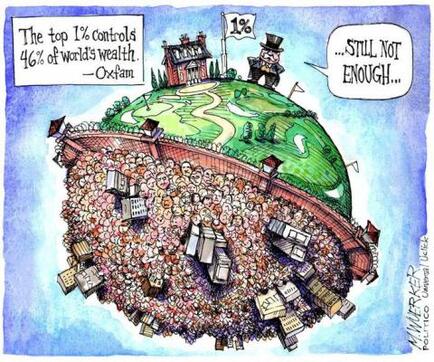
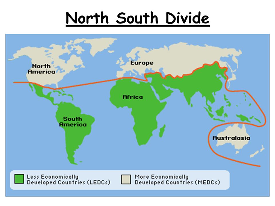
Study the two images below carefully. They are taken from a Google Search 'rich world poor world'.
Image 1 - is based on an Oxfam report that 1% of the richest population controls 46% of the world's wealth - source here.
Image 2 - is the Brandt Line. Devised by Willy Brandt (The German Chancellor) in the 1980's to show the division of the world into two. The so-called Rich North and the Poor South - source here
Discuss - In what ways do both images suggest that the world is divided in two?
Suggest - What are the problems with the second image today?
Complete the worksheet below by colour coding the different terms that we have previously used to categorise countries into rich, poor or more recently 'in between'.
So, what should "WE" call "THEM"?
Quote from Factfulness p.32-33:
What we should do is stop dividing countries into two groups. It doesn't make sense anymore. It doesn't help us to understand the world in a practical way. It doesn't help to find business opportunities, and it doesn't help aid money to find the poorest people. But we do need some kind of sorting to make sense of the world. We can't give up on our labels and replace them with .... nothing.
What should we do?
You are now going to complete some group work where you will be finding out a bit more about life in each level. Think of each level as a level on a computer game. Everyone wants to move from level 1 to level 2 and upward through the levels from there. Only, it's a very strange computer game, because level 1 is the hardest. Let's play.
Task 1 - Sort them out!
Your teacher will now give you an envelope with the cards inside. Your job is to sort them into the four levels as set out above. You can use the A3 crib sheet to sort your cards on to.
You will have noticed that there are pictures on one side. Ignore these for now. Please make sure that the cards have the text side facing up.
You should now have your cards placed into the four columns. Can you make other categories within these levels e.g. water supply?
Task 2 - Sure about it? Now stick it!
You can now stick down your cards onto your A3 crib sheet and fill in your data sheet.
Task 3 - Time to write about what you know.
Your task is now to be very concise and write 50 words about life in each of the four levels. You are going to complete this activity using **this PowerPoint template**.
You should use your A3 sheet and stuck down paper slips to help. You can also click on this link to read the information. from Gapminder
Task 4 - Review Your Learning.
Now watch the TED Talk video featuring Hans below. It starts off by talking about the development gap that Hans experienced in the 1960's but how that is now changing (as you found out in your card sort). Note: This video is from 2010 and so the total numbers in each level have changed positively since then.
Remember... 'Stuck in the middle with you'.
Factfulness is . . . recognizing when a story talks about a gap, and remembering that this paints a picture of two separate groups, with a gap in between. The reality is often not polarized at all. Usually the majority is right there in the middle, where the gap is supposed to be.
To control the gap instinct, look for the majority.
• Beware comparisons of extremes. In all groups, of countries or people, there are some at the top and some at the bottom. The difference is sometimes extremely unfair. But even then the majority is usually somewhere in between, right where the gap is supposed to be.
This can be seen in the bubble chart measuring global development. Most people are in the middle.
• The view from up here. Remember, looking down from above distorts the view. Everything else looks equally short, but it’s not.
This can be seen from our experiences in Level 4 and trying to see clearly what life is like elsewhere in the other three levels. Media also plays a part.


