
What if the World Was a Village of 100 People?

|

|
|
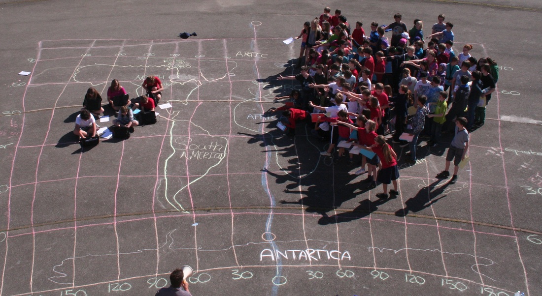
In May 2013, the Maths & Geography department at IST teamed up to create an interactive activity based around this popular classroom activity. You can read Mr Podbury's blog here or Mr Noble's blog here to find out how we did it.
Here are our main sources of inspiration: 1. Pinterest Page 2. Binsworld - Pre Activity Game 3. Activities Website. 4. The YouTube video to the right hand side. Starter: Watch the video to find out what it is all about. |
|
What's the Story Behind the Data?
Objective: To create a Fotobabble montage using three IST photos & GapMinder to find out about the background to the disparities in our global village.
Study the images on the presentation created by Mr Noble above. Choose your three most surprising images and write down a few sentences to describe why they surprise you. You will have 5 minutes to discuss this with your teacher and people in class.
Study the images on the presentation created by Mr Noble above. Choose your three most surprising images and write down a few sentences to describe why they surprise you. You will have 5 minutes to discuss this with your teacher and people in class.
Story 1 - Access to ComputersOur photo to the right shows us that 95% of the world's population has no access to college education. Only 5% do.
Click here to be taken to GapMinder World showing a graph that plots Personal Computers/100 people against GDP (general wealth of population) |
|
- You will see that there are a number of bubbles all over the screen. The colour of the bubble refers to the continent where the country is found (Americas - Yellow, Sub-Saharan Africa - Blue etc). This will be really useful later for looking at patterns.
- The size of the bubble is relative to the total population size. You should be able to spot China straight away.
- The positioning of the bubbles depends on how developed the country is and how many computers they have / 100 people.
- A bubble in the top right hand corner would indicate a very wealthy country where everyone has a computer.
- A bubble in the bottom left hand corner would indicate a very poor country where few people have computers.
Task 1 - Copy the story title from above and the photo onto a new Word document. Then, select the following countries from the menu on the right hand side of the graph:
Burundi (Africa)
Canada (North America)
China (Asia)
France (Europe)
Press play and allow the sequence to develop from 1990 until 2006. You should see four trails that have been left behind.
Task 2 - Describe the patterns left behind by the four countries. Any surprises? Make notes and take a screenshot of what is left behind.
Task 3 - Now un-tick the four countries until you are left with a variety of bubbles. If you hover over a colour on the world map in the top left hand corner, all the countries in that continent will flash on the graph. Complete the following questions:
a. Which continent has the highest Personal Computer Usage / 100 people?
b. Which continent has the lowest Personal Computer Usage / 100 people?
c. What is the relationship between GDP/PPP (wealth of a country) and Personal Computer Usage?
|
|
d. Where are the 5% 'Have Computers' likely to live and why?
e. Name five countries that are likely to represent a significant proportion of that 95% that don't have. Task 4 - Watch the video to the right hand side and take notes on the situation in Africa (blue). Task 5 - Now download the IST photo above to your FotoBabble account and create and record a 30 second clip that explains the Geography behind the data. |
Story 2 - Access to College EducationOur photo to the right shows us that 99% of the world's population has no access to college education. Only 1% (Thibauld) does. College refers to education from the age of 16 years old onwards and includes universities too.
Click here to be taken to GapMinder World showing Primary School Completion Rate (% of children that get to the end of primary school) against GDP (general wealth of population) |
|
Although there is no GapMinder data to show access to College Education, we can suppose that the majority of children who do not finish primary school, will not therefore go on to secondary school and then college/university.
Task 1 - Copy the story title from above and the photo onto a new Word document. Then, select the following countries from the menu on the right hand side of the graph:
Niger (Africa)
Canada (North America)
India (Asia)
France (Europe)
Press play and allow the sequence to develop from 1970 until 2010. You should see four trails that have been left behind.
Task 2 - Describe the patterns left behind by the four countries. Any surprises? Make notes and take a screenshot of what is left behind.
Task 3 - Now un-tick the four countries until you are left with a variety of bubbles. If you hover over a colour on the world map in the top left hand corner, all the countries in that continent will flash on the graph. Complete the following questions:
a. Which continent has the highest % of primary children finishing primary school?
b. Which continent has the lowest % of primary children finishing primary school?
c. What is the relationship between GDP/PPP (wealth of a country) and the completion of Primary Education?
d. Where does the 1% 'Receiving College Education' likely to live and why?
e. Name five countries that are likely to represent a significant proportion of that 99% that don't have.
Task 4 - Watch the videos below and take notes on the situation in Niger (blue) & India making reference to the data on the Gapminder graph.
Task 5 - Now download the IST photo above to your FotoBabble account and create and record a 30 second clip that explains the Geography behind the data.
- You will see that there are a number of bubbles all over the screen. The colour of the bubble refers to the continent where the country is found (Americas - Yellow, Sub-Saharan Africa - Blue etc). This will be really useful later for looking at patterns.
- The size of the bubble is relative to the total population size. You should be able to spot India straight away.
- The positioning of the bubbles depends on how developed the country is and how many children complete their primary education.
- A bubble in the top right hand corner would indicate a very wealthy country where everyone completed primary school and there is a good chance that they will go on and complete secondary & college education.
- A bubble in the bottom left hand corner would indicate a very poor country where few children complete their primary education and there is a very good chance they won't ever go to secondary school or college.
Task 1 - Copy the story title from above and the photo onto a new Word document. Then, select the following countries from the menu on the right hand side of the graph:
Niger (Africa)
Canada (North America)
India (Asia)
France (Europe)
Press play and allow the sequence to develop from 1970 until 2010. You should see four trails that have been left behind.
Task 2 - Describe the patterns left behind by the four countries. Any surprises? Make notes and take a screenshot of what is left behind.
Task 3 - Now un-tick the four countries until you are left with a variety of bubbles. If you hover over a colour on the world map in the top left hand corner, all the countries in that continent will flash on the graph. Complete the following questions:
a. Which continent has the highest % of primary children finishing primary school?
b. Which continent has the lowest % of primary children finishing primary school?
c. What is the relationship between GDP/PPP (wealth of a country) and the completion of Primary Education?
d. Where does the 1% 'Receiving College Education' likely to live and why?
e. Name five countries that are likely to represent a significant proportion of that 99% that don't have.
Task 4 - Watch the videos below and take notes on the situation in Niger (blue) & India making reference to the data on the Gapminder graph.
Task 5 - Now download the IST photo above to your FotoBabble account and create and record a 30 second clip that explains the Geography behind the data.
|
|
|
Story 3 - Access to Clean WaterOur photo to the right shows us that 17% of the world's population has no access to clean water. Can you name some of the diseases that are spread by drinking contaminated water?
Click here to be taken to GapMinder World showing Improved Freshwater Access against GDP (general wealth of population). |
|
- You will see that there are a number of bubbles all over the screen. The colour of the bubble refers to the continent where the country is found (Americas - Yellow, Sub-Saharan Africa - Blue etc). This will be really useful later for looking at patterns.
- The size of the bubble is relative to the total population size. You should be able to spot India & China straight away.
- The positioning of the bubbles depends on how developed the country is and how many people have improved access to freshwater.
- A bubble in the top right hand corner would indicate a very wealthy country where everyone has access to freshwater in bottles or by taps.
- A bubble in the bottom left hand corner would indicate a very poor country most people have to drink sub-standard water that can lead on to other diseases like Cholera.
Task 1 - Copy the story title from above and the photo onto a new Word document. Then, select the following countries from the menu on the right hand side of the graph:
Somalia (Africa)
USA (Americas)
Haiti (Americas)
France (Europe)
Press play and allow the sequence to develop from 1990 until 2010. You should see four trails that have been left behind.
Task 2 - Describe the patterns left behind by the four countries. Any surprises? Make notes and take a screenshot of what is left behind.
Task 3 - Now un-tick the four countries until you are left with a variety of bubbles. If you hover over a colour on the world map in the top left hand corner, all the countries in that continent will flash on the graph. Complete the following questions:
a. Which continent has the highest % of populations with safe access to water?
b. Which continent has the lowest % of populations with safe access to water?
c. What is the relationship between GDP/PPP (wealth of a country) and access to safe water?
d. Where are the 17% 'Don't Have Safe Water' population likely to live and why?
e. Name five countries that are likely to represent a significant proportion of that 83% that 'Do Have'.
Task 4 - Watch the videos below and take notes on the situation in Africa (blue) & Europe (Evian Advert) making reference to the data on the Gapminder graph.
Task 5 - Now download the IST photo above to your FotoBabble account and create and record a 30 second clip that explains the Geography behind the data.
|
|
|