Using Weather Data
Students at the International School of Toulouse will complete climate graphs activities in the Rainforests & Deserts unit of work - here
|
Objective: To understand how weather data can be used in forecasting and to learn to draw a climate graph.
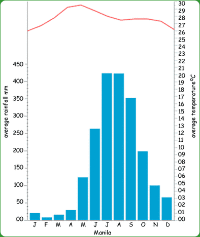
Climate graphs show the average temperature and rainfall for a city or region over the year. Temperature is always shown in the form of a line graph. Some climate graphs have the average maximum temperature and the average minimum, others just have the overall average temperature. The line graph is normally coloured in red. Rainfall is always shown in the form a bar graph and normally coloured in blue. Climate graphs are very good for showing averages, but they don't show anomalous years, because it is based on averages and it doesn't show things like the number of days of rain. A month may have 50mm of rain, but we don't know if that comes in small rain showers or one big thunderstorm. When reading climate graphs you should look for trends and anomalies. *Thanks to Greenfield Geography Wiki* Task 1 - Study the climate data for Toulouse carefully underneath. Using a paper copy of this template, plot out the annual climate graph for Toulouse as following: (Click the data table to make it bigger)
|
|
Task 2 - Describe the annual climate of Toulouse using the trends on the two graphs that you have just drawn.


