Introducing Global Development
Starter: Complete page 1 & 2 of the worksheet below. Don't take the phrase 'live without' too literally and go for 'obvious' things like oxygen. Think more about the items you couldn't "live without" or food or drink that, if it was taken away from you, would be really testing!
|
|

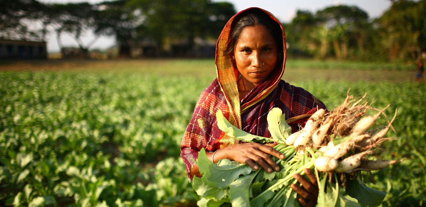
How Does Wealth Vary Around The World?
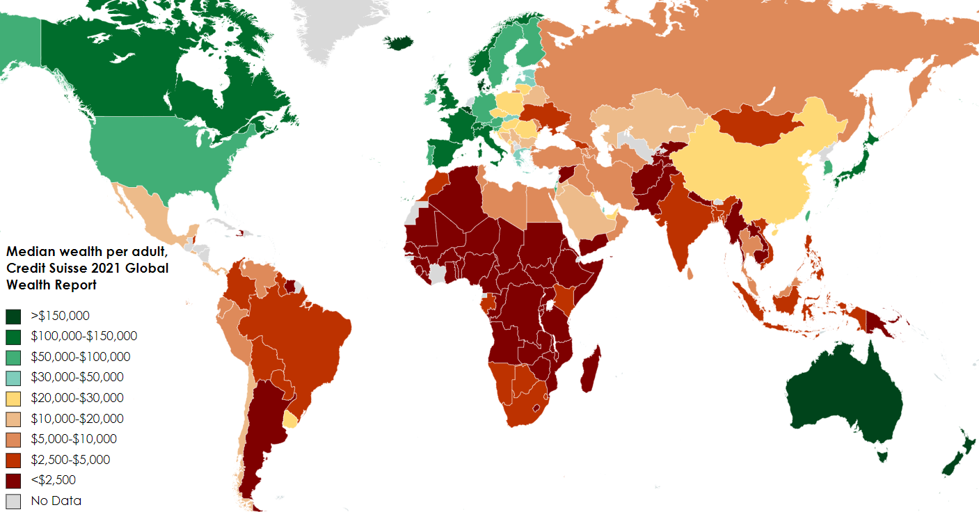
Task 5 - How does wealth vary around the world?
a. To do this, you need to find out the GDP per capita (means per person) of your home country.
b. Either ..... type this in to Google. For example, the current GDP per capita of France is $55,064 (source). This is about €51,550.
c. ...... or you can use this Wikipedia list to find your country
GDP per capita is a measure of a country's economic output that accounts for its number of people. It divides the country's gross domestic product by its total population. That makes it the best measurement of a country's standard of living. It tells you how prosperous a country feels to each of its citizens.
d. Now, copy this figure and enter it into this wealth calculator. Choose your home country, add the GDP value in the home currency (€ £ etc) and then choose 1 adult and 0 children (gives per adult).
e. Take a screen shot of the first two charts and copy them onto a word document.
So, how does the average person in your home country compare to some of the richest people on Earth?
f. Click here to be taken to another calculator.
g. Scroll down and choose your CEO (Chief Executive Officer), choose annual salary and then enter the expense amount as the GDP per capita of your home country in American $.
h. Play around with two or three CEO's and check out how long it takes them to earn the annual GDP per capita of your home country! Take screenshots.
i. Create a poster / infographic / PowerPoint that compares the wealth of the super rich, to the wealth of the poorest half of the world population. Here is the 2022 report from Oxfam and you should consult the videos below too. You might find some inspiration for your infographic here.
|
|
|
Extension Task - Should we ban Billionaires?
Click here to listen to an excellent podcast from the BBC. Take notes on the note taking sheet below.

Historical Global Development Divisions

The Brandt Line is a way of visualising the world that highlights the disparities and inequalities between the wealthy North and the poorer global South. It was popularised in 1980 through North-South: A Programme for Survival, a report addressing the problems of international inequality written by a committee led by the former German chancellor, Willy Brandt.
The report proposed a set of policies to address problems of global inequality and poverty, and to overcome the political tensions that had emerged between the wealthy, industrialised North and the less economically developed (or underdeveloped) global South. The report included a map of the world divided into North and South by the ‘Brandt Line’, which became one of the most recognisable and influential ways of representing the economic and political divisions of world politics. (source)
Task 7 - Imagine that you were part of writing that North-South Programme for Survival in 1980. Where would you place the line? Download and draw your own line on the worksheet below.
So, how does wealth and development vary across the world?
i. Watch the video above. It lasts for 11 minutes. Take notes on your Task 7 worksheet (second side) using the titles in the table.
But, how relevant is the Brandt line today?
You should remember your work from G6 about 'The Gap Instinct'. You completed a card sorting exercise and should remember this information. Remember, Hans Rosling says that most people live somewhere in the middle. But of course, there is no middle on a divided world - there is only rich & poor.
Task 8 - Click on the tab below to access a worksheet that contains your task.
Introducing the Human Development Index
FACTFULNESS & THE HDI LEAGUE
Objective: To find out what HDI means, what it measures and how is it calculated and where most countries are located.
Starter: Watch the first two videos to the right to introduce two of the countries we will be studying.
Task 1 - The BBC page here will help to answer the questions below. Answer these questions on your worksheet.
a. What does HDI stand for?
b. Name the four composite indicators that are included in HDI (there are two for education).
c. On what scale is the HDI measured?
d. Which value is the highest and which value is the lowest?
Task 2 - In the space on the worksheet, outline the advantages and disadvantages of the HDI.
Task 3 - Click here to be taken to an interactive website of countries linked to their HDI rating.
Individually, click on:
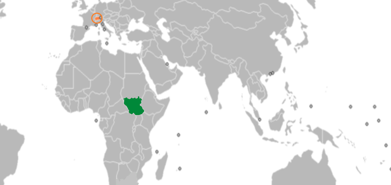
- South Sudan
- Switzerland
- France
- and your home country (if none of the three above).
Look underneath the graph and record the key data for each country on your worksheet.
Using your worksheet, describe the trends shown on the graph that opens up making sure you talk about the value in 1990 and the value today as well as the shape of the line and anything unusual that happens.
Switzerland & South Sudan Presentations
|
Task 4 - The Presentation Task Choose a partner in the class and get into contact with them via Teams. Decide who is going to research South Sudan and who is going to research Switzerland. You have two lessons to put together a short presentation to give to your partner via Teams. You can share your presentation and talk through what you have learned. Step 1 - Know Your Location Don't forget to look at the map at the top of this section to see where both countries are located. Step 2 - Create a fact sheet on either South Sudan or Switzerland. You may want to focus on:
Step 3 - Additional Research As you remember from your work on Dollar Street, not everyone in Switzerland is wealthy and not everyone in South Sudan is poor. Try to find an image or a news story that shows this different side to the country and explain the story too. |
Click to enlarge
|
Step 4 - Present to one another - Homework Task
Use Teams during your Geography lesson. Your teacher will tell you when. When the presentation has finished, you should share the fact sheet with your partner.
Snakes & Ladders - HDI
Objective: To find out which factors hinder development and which factors help development.
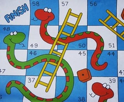
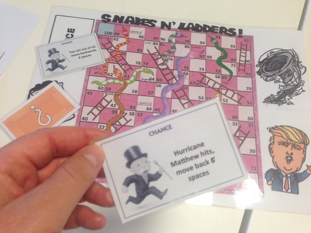
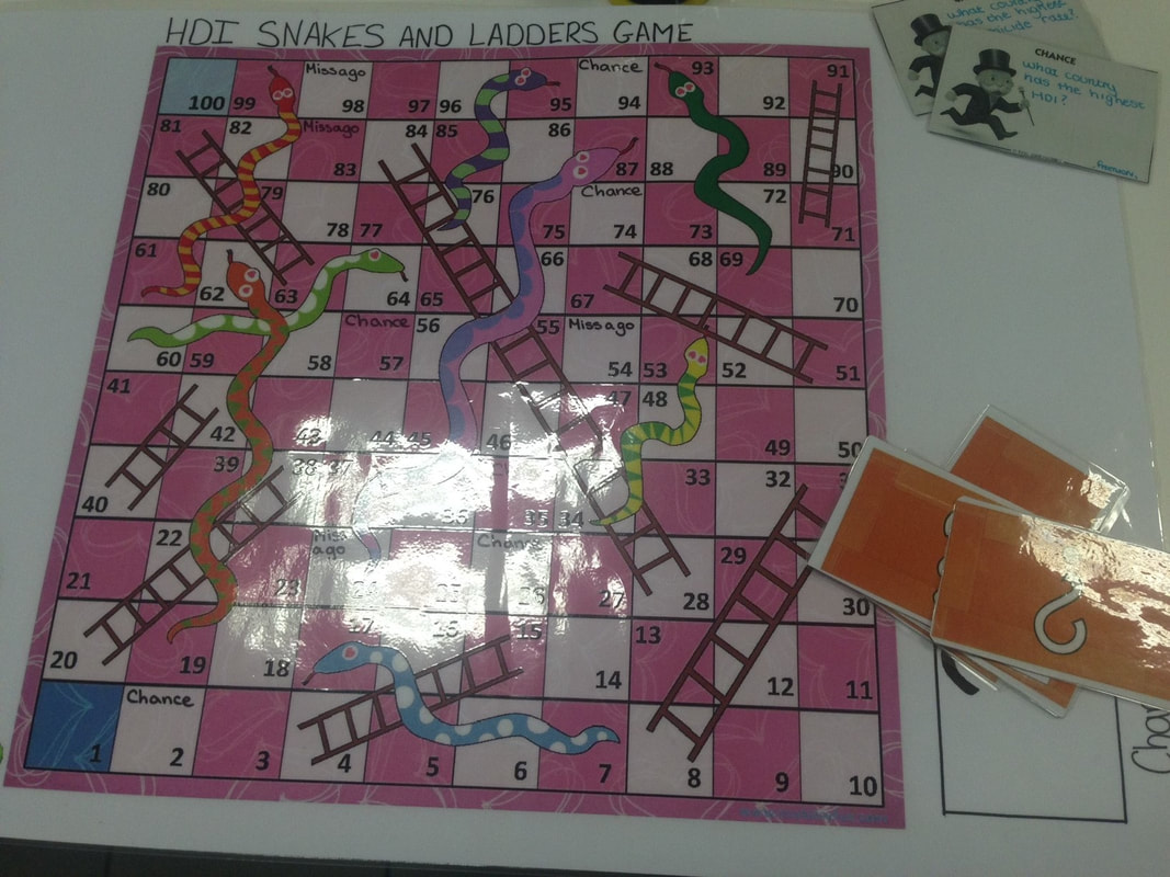
Task 1 - You are going to be completing your own snakes and ladders board game, like the one in the photo beneath. To do this, you will need the following resources.
Resource 1 - Snakes & Ladders Board
Resource 2 - Snakes & Ladders Scenarios
Resource 3 - Chance Cards
Resource 4 - Snakes & Ladders Feedback Sheet
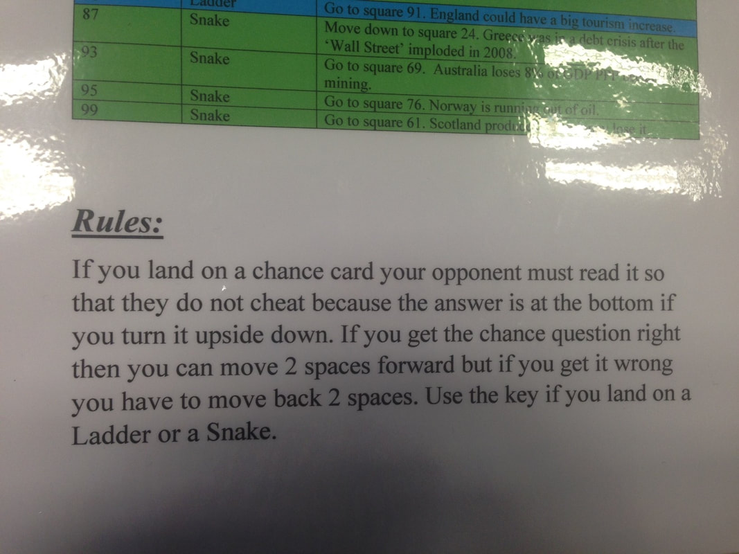
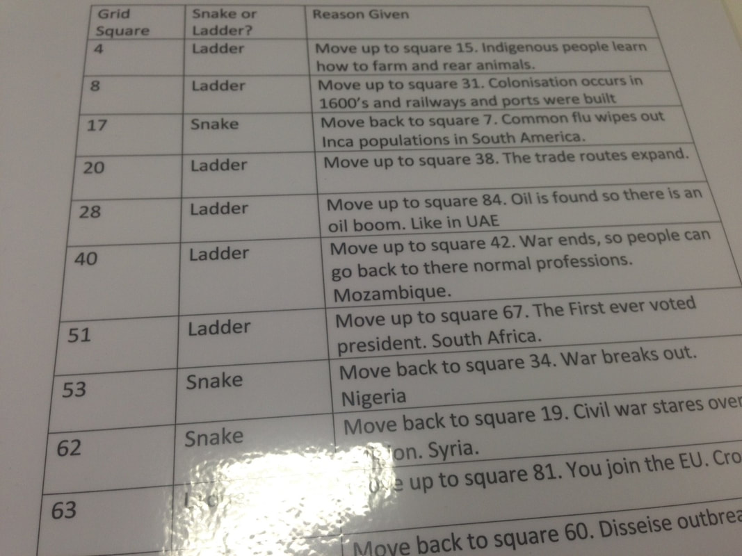
A ladder would indicate something that would boost development (medical breakthrough, peace, technology, education, jobs) whilst a snakes head would indicate something that would hinder development (war, disease, famine, dictator, natural hazard etc)
Try to attribute the current HDI values against places on the board. In 2022, the highest placed HDI country was Switzerland with 0.96 (so square 96 on the board) and the lowest is South Sudan with 0.38 (so square 38 on the board). The current HDI league table can be found by clicking here.
Any snakes head or foot of the ladder before square 37 (Niger) should be a historical event that would have positively or negatively influenced the level of development in a country (see the first three examples in Resource 2 above).
You can create up to 5 chance cards to insert anywhere in the game. This can be positive or negative scenarios that could reflect current political events etc.
The Snakes and Ladders rules are here just in case.
Task 1 - You are going to be completing your own snakes and ladders board game, like the one in the photo beneath. To do this, you will need the following resources.
Resource 1 - Snakes & Ladders Board
Resource 2 - Snakes & Ladders Scenarios
Resource 3 - Chance Cards
Resource 4 - Snakes & Ladders Feedback Sheet
A ladder would indicate something that would boost development (medical breakthrough, peace, technology, education, jobs) whilst a snakes head would indicate something that would hinder development (war, disease, famine, dictator, natural hazard etc)
Try to attribute the current HDI values against places on the board. In 2022, the highest placed HDI country was Switzerland with 0.96 (so square 96 on the board) and the lowest is South Sudan with 0.38 (so square 38 on the board). The current HDI league table can be found by clicking here.
Any snakes head or foot of the ladder before square 37 (Niger) should be a historical event that would have positively or negatively influenced the level of development in a country (see the first three examples in Resource 2 above).
You can create up to 5 chance cards to insert anywhere in the game. This can be positive or negative scenarios that could reflect current political events etc.
The Snakes and Ladders rules are here just in case.
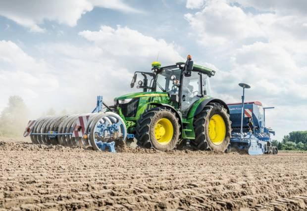
How to feed 11 billion people...
|
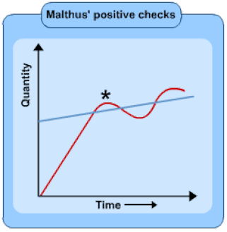
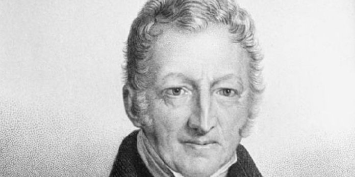
Pessimist - Thomas Malthus
1766-1834 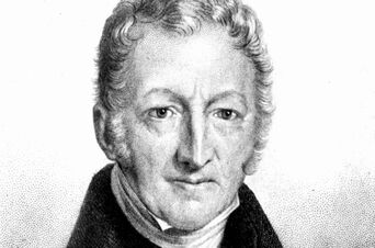
Malthus was writing at the end of the 18th century. He believed that only bad could come from population growth. Population, he said, grows faster than food supply. He said this was because food supply could not possibly keep up with population growth. Remember, this was back in 1798 and agriculture was very different from nowadays.
|
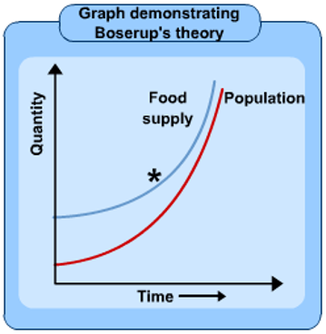
Optimist - Ester Boserup
1910-1999 
Boserup said that food supply would increase to accommodate population growth. As a populations found that they were approaching food shortages they would identify ways of increasing supply whether through new technology, better seeds or new farming methods. Today this can be seen in GM and high yield variety crops.
|
Starter: Read the information above carefully and study both graphs.
Task 1 - Define pessimist and optimist.
Task 2 - Use the information above and also carry out some more research to create an A4 fact file on both of the people above. You should include the following:
* Name & when alive
* Photo / Portrait
* Their beliefs (how does population link to food supply)
* A graph to show their beliefs (above).
* One reason to believe what they said
* One reason to disbelieve what they said.
* A recent news story headline that proves that each was right. (Boserup 2021 story & Malthus 2021 story in French)
Task 3 - Listen to the BBC Inquiry Podcast Below - How can we feed 11 billion people? Take notes on the worksheet below.
Population & Food - Mini Assessment
|
This task should take you approximately 2-3 hours to complete. It will be graded and results will be shared with you and your parents. It is a summative assessment that shows me how much you have understood of what we have learnt so far.
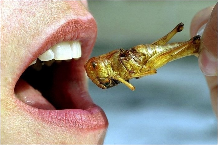
Assessment Task - So, which side are you on? A Malthusian or an Anti Malthusian (Boserup)? Produce a minimum 500 word essay (with images) to explain who you support and justify your decision with facts, data and recent news events to prove your point. You could watch the two videos below to help you understand the issues a little more before you start. Suggested Structure: 1. Introduction Describe the two opposing viewpoints to food supply & population growth (Malthus & Boserup). Use graphs to help your explain the relationships between population growth and food production (see above). 2. Problem Food What are the food types that are problematic to our planet & our people? (this 5 minute video is excellent). 3. Population Growth Describe historical and future global population growth (this graph will help). 4. Feeding 11 Billion People Describe and explain the problems in trying to feed up to 11 billion people. Name two places in the world where food shortages are already a problem (BBC Inquiry podcast notes) 5. Future Food How might our future food change? Give one example of how we might use technology / science to keep up with demand and two examples of future food types (BBC Inquiry podcast notes & videos below) and how they could meet our nutritional needs. 6. Conclusion Now tell me what you thoughts are. Are we in for a food revolution or for mass starvation? Are you a 'Malthusian' or an 'Anti Malthusian'? Formal Requirements a. A title page with the name of the investigation 'Malthusian or Anti Malthusian - A report by *your name*'. Add a suitable image, your name and the total word count b. A contents page c. Number your pages d. References page e. Any images or graphs should have a caption (title) and a figure number. |


|
|
|
|
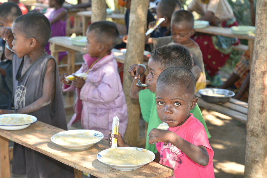
Food Supply & Malnutrition
Objective: To learn a little more about the issues facing people with limited access to food around the world and the features and extent of malnutrition.
Task 1 - Watch the video underneath that was produced by school students in New Zealand (a HIC).
Make notes using the guidelines to the right of the video. Use this worksheet.
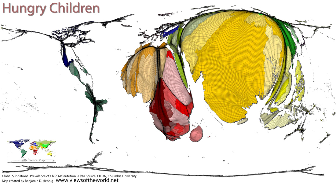
What Does Hunger Look Like?
Task 2a - Using this PowerPoint document, complete the activity in on the first side of the worksheet below.
Task 2b - What does the map below show, and why? Write your thoughts on the second side of the Task 2 worksheet.
But, When People Eat Too Much of the Wrong Thing...
|
|
|
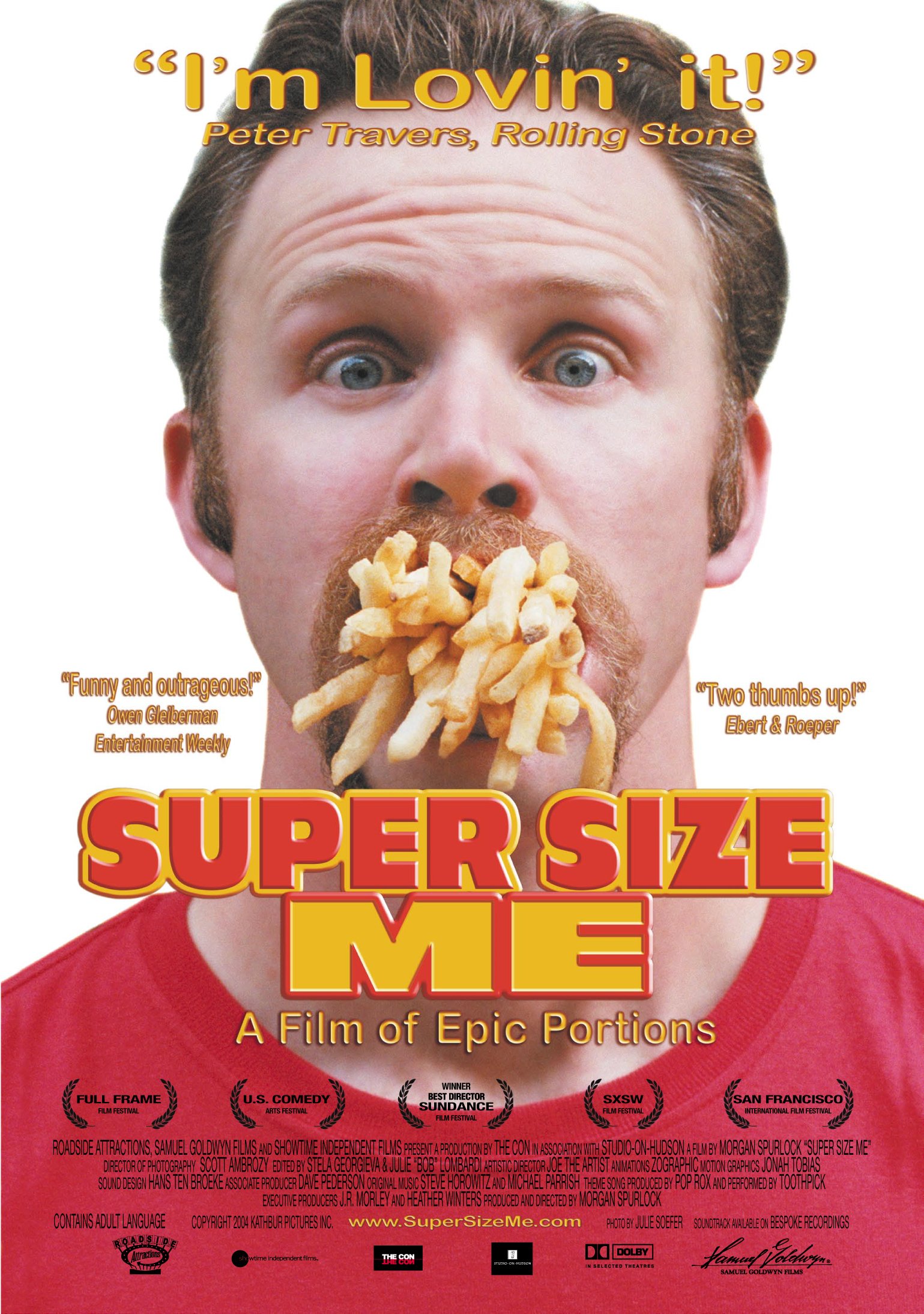
Task 2 - Supersize Me (2004)
Watch the opening sequence of Supersize Me - a documentary film from 2004. Spend 10 minutes researching the film and create a brief fact sheet about the plot. You can use these prompts as your starting point.
Here is a review site for the film.
Task 3 - Watch this short video about a different sort of Malnutrition.
You have studied the impacts of malnutrition on children in some of the poorest countries in the world (LIC's) but what about in the richest countries ( HIC's)?
Does malnutrition exist there in a different form?
Then check out this article from the Guardian.
Read the article linked above and make notes on the impacts of eating the wrong (french word: mal) sorts of foods in large quantities.
Extension Task - Create a 1 side of A4 factsheet on Word or PowerPoint about obesity. You should include:
1. The causes
2. The effects (same link as above)
3. The countries most affected - link
4. Why the Pacific Islands have such a problem - link
5. One map & one image.
To finish off...
What impacts to soft drinks have on the developing world? Spend half the lesson watching this excellent documentary from Channel 4, reporting on the huge consumption of Coca Cola in some areas of Mexico. Take notes using the framework sheet below.
Food Distribution -The Cake Game
Europe with nearly 1/3 of the whole cake!
Objective: To find out about the inequalities that exist with the supply and provision of food in the developed and developing world (and to eat some cake)
Lesson Plan
PowerPoint
Table Labels
Chance Cards
Continent Cards - To be picked out by each student
How to divide up the cake
This takes some organisation and just about fits in to an hour lesson.
Lesson Plan
PowerPoint
Table Labels
Chance Cards
Continent Cards - To be picked out by each student
How to divide up the cake
This takes some organisation and just about fits in to an hour lesson.
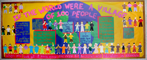
What if the World Was a Village of 100 People?
|
Objective: To discover important global development patterns by shrinking the world to one small village.
We live in a world of almost 7.8 billion people. Yes, that's seven thousand eight hundred million people! A lot. There are some amazing statistics out there but they are very difficult to apply to such a big number of people. There is an excellent concept that reduces the global population to a village of 100 people. Task 1 - Check out the video to the right. You will need to watch it twice. I would like you to choose 10 global village facts to turn into a presentation of your choice to show what you consider to be the 10 biggest issues / most interesting statistics. Your presentation can take the form of a poster, PowerPoint, video, infographic, prezzie etc. You choose. You might want to take some inspiration (not copy) from this site. Task 2 - You will be sharing your presentation with one other person in the class when complete. They will use the very simple mark scheme below to mark it and provide you with some feedback. Mark Scheme |
|
A few years ago at IST, Mr Noble and I used students to create a real life interactive video to show some of these trends. The videos were filmed out on the school yard just in front of the maths classrooms. Check out the videos below...
|
|
|
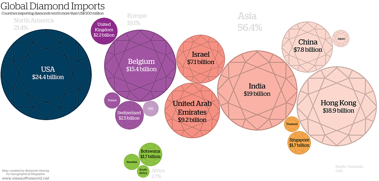
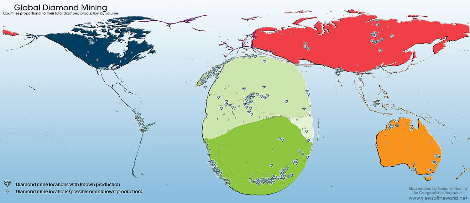
The Trade in Diamonds
Objective: To understand how and where diamonds form and the impacts that they have on communities around the world.
Starter: A gift of love?
Watch the video below to find out why we buy diamonds and the De Beers marketing campaign that have placed diamonds at the centre of marriage.
Starter: A gift of love?
Watch the video below to find out why we buy diamonds and the De Beers marketing campaign that have placed diamonds at the centre of marriage.
|
|

|
Task 1 - Try to find the most outrageous example of a diamond related product. Perhaps a mobile phone case or even ... a car! Complete the first activity on the worksheet above.
Task 2 - Complete the rest of the activities on the worksheet using the resources provided and the videos below.
|
|
The images above will help you with Task 4 on your worksheet. You can click to enlarge them.
|
|
|
Task 3 - How can diamond mines be mined? - Check out the two videos below. Write a summary that describes the similarities and differences between the two mines. Why do you think one mine uses machines and the other uses humans? Also, comment on the environmental impact of the mines.
|
Mine 1 - Canada (HIC)
|
Mine 2 - Sierra Leone (LIC)
|
Task 4 - Is there a less environmentally damaging way to mine diamonds? Watch the 8 minute video below and write some notes on why lab grown diamonds are claimed to be better than mined diamonds.
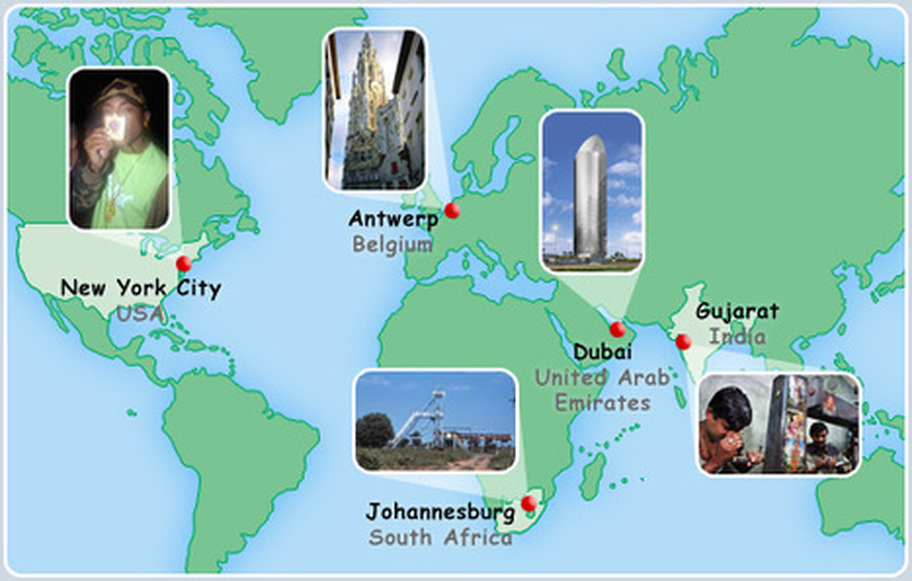
Global Diamonds -Movers & Shakers

*Thanks to Global Eye, Noel Jenkins and Wycombe High School
Imagine you are one of the movers and shakers in the diamond chain. In groups of five:
Imagine you are one of the movers and shakers in the diamond chain. In groups of five:
- Each choose a different location on the map below.
- Open the documents below to find out who you are.
- Read your profile to find out what you do.
- Ask each other questions to learn about each other’s lives in the diamond chain.
- Together, make a flow diagram to summarise your five lives and how you are connected.
Your Interactive Display
"Who gives a damn about the ice on your hand - If it’s not too complex tell me how many Africans died for the bagguettes on your Rolex ..." Ms Dynamite: "It takes more"
You are now in the position to begin to put together your display. The display should be as interactive as possible to allow student interaction. Possible ways of making this happen are:
1. Lift up flaps
2. QR codes that take students to safe websites where they can find out more.
3. Challenge type questions
The display should aim to educate the reader on the geology, politics and socio-economic factors (positive & negative) that surround blood or conflict diamonds.
The structure of the presentation is up to you, however there needs to be an A3 map of the world as the centre piece showing the countries involved in the diamond trade (above). These locations should be linked together with flow arrows and contain financial information showing how the value of the diamonds increases as they travel through the production process (see resource 3 below).
Resources:
1. Geology and formation of diamonds - Use the information at the start of the unit.
2. The socio economic impacts of blood diamond production - Use this excellent report from Global Witness.
3. How the value of the gems increase as they move through the production chain. - Animation here (click on cash registers)
4. Diamonds - A poem from Sierra Leone
5. How can we avoid buying conflict diamonds? - An information leaflet for UK consumers. Don't forget your work on the Kimberley Process too!
6. PowerPoint with suggested structure - To give you some ideas.