
|
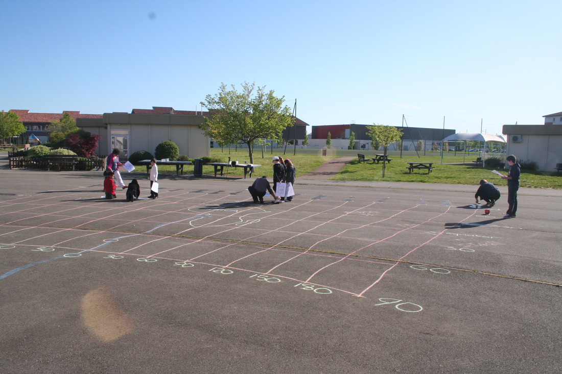
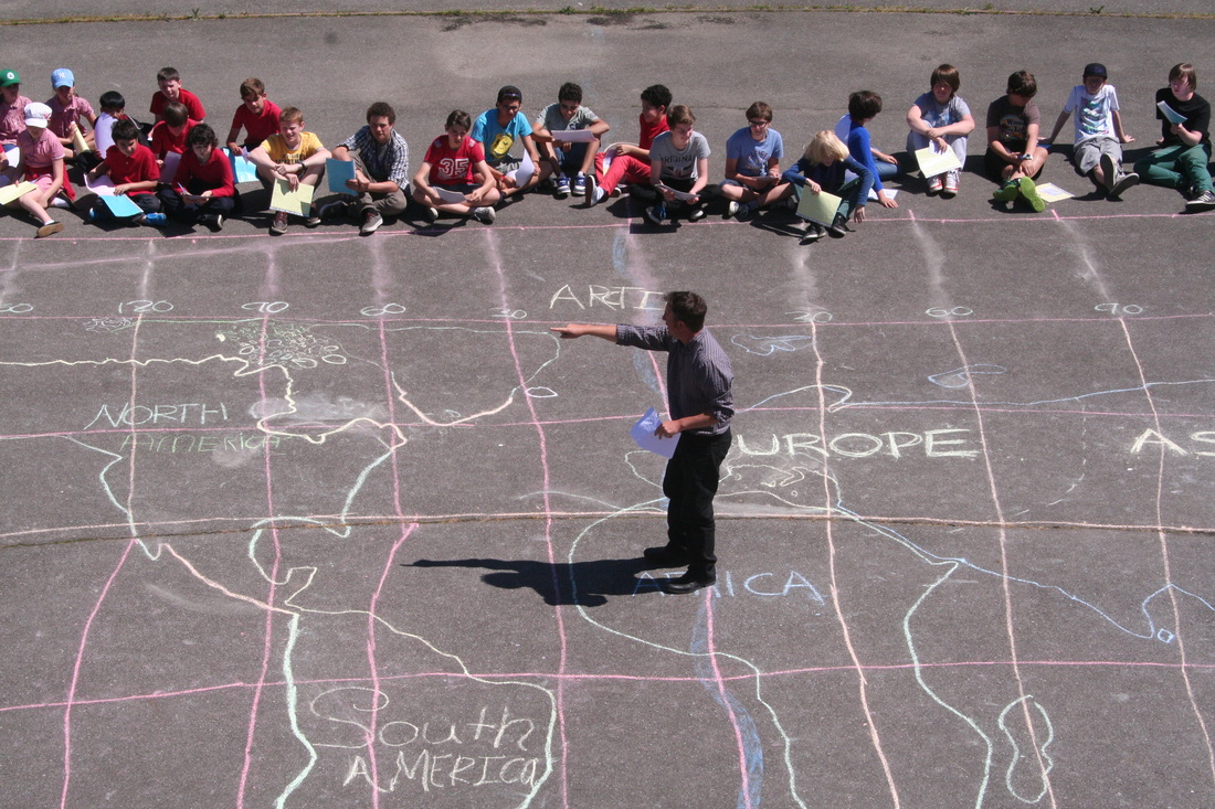
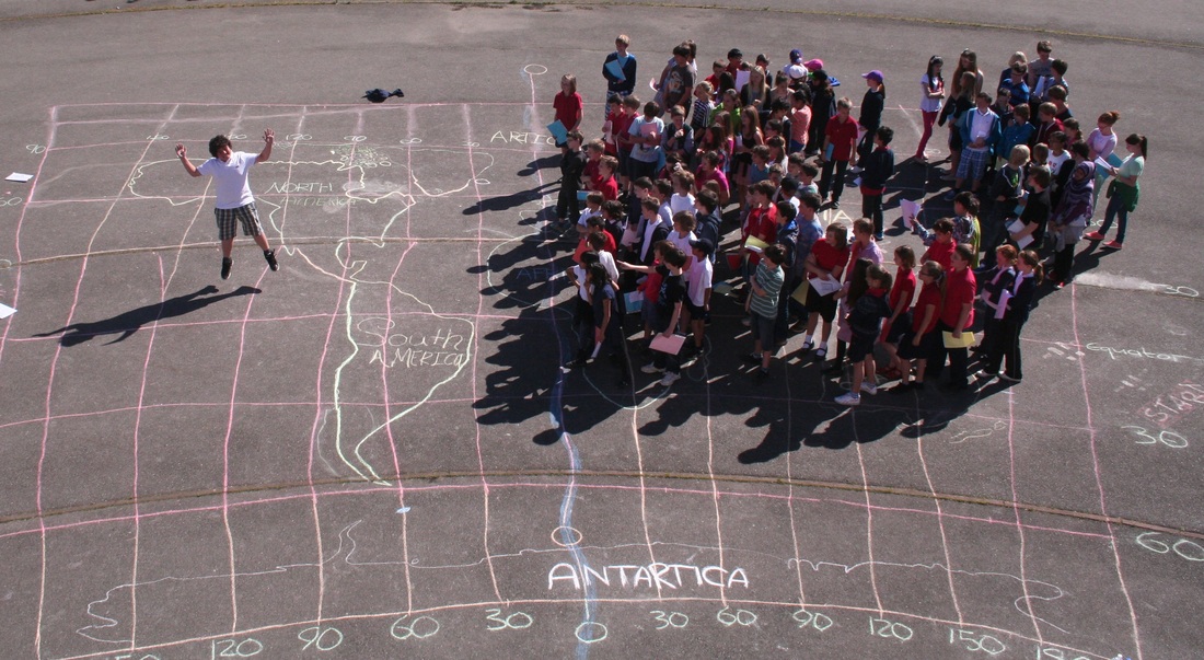
I have been working with Jim Noble, the Head of Maths at IST, and preparing for the forthcoming visit of GapMinder to the school next week. They would like to come in to school and see how we currently use their site and resources in Maths & Geography lessons. Both Jim and I have ideas on how we would like GapMinder to develop resources or allow the editing of resources for a school. We thought we might do something a bit out of the ordinary with the students in preparation for the visit and produce something very visual that could be used in conjunction with the Gapminder site next Monday during their visit. We decided to get together 100 students from Year 5, 6 (crossover), 7 & 8 and provide them with easy to read scenarios that would tell them where they needed to be placed on a world map and a colour that they would need to hold above their heads. Each student was given a plastic wallet with 5 different coloured pieces of paper and two sets of instruction cards. This was a huge amount of work and all credit to Jim for persevering with the creation of the cards on Excel during his Easter holidays. This morning we had to draw a decent(ish) map on the school yard with the help of some Year 5 & 6 students and their teachers, Simon Gregg & Isobel Patrick.
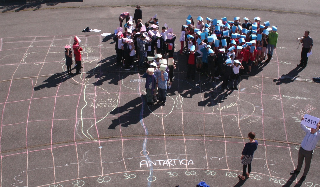
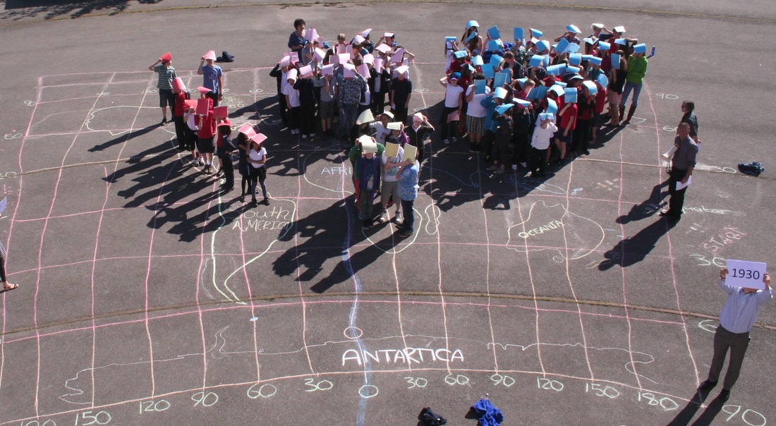
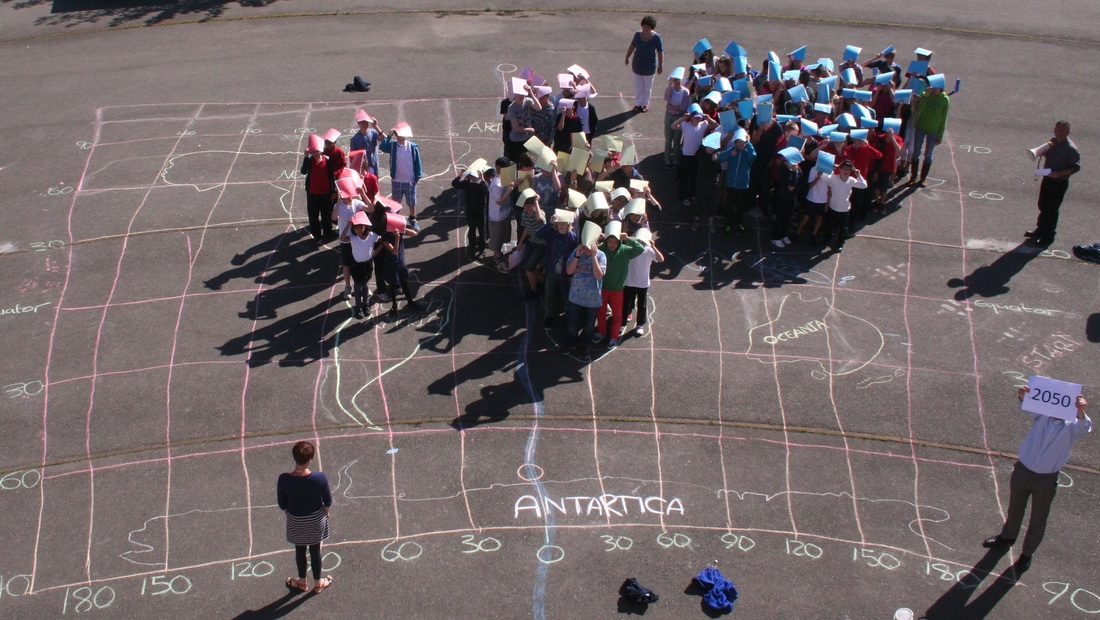
The activity had been planned by Jim in three stages. Stage 1 - Population Growth from 1810 to 2050 (projected) in 20 year intervals 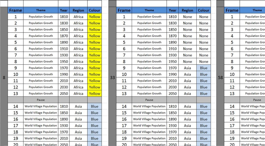 As I stated above, Jim had the unenviable task of going back through all the raw data, extracting information, setting up an Excel spreadsheet and creating, cutting and sorting 100 individual cards that for the 20 stages. Each card told any particular student where they were to stand and what colour they should hold up above their head. Above is a screen shot of a couple of the cards so you can see how it worked. Jim then positioned himself on the roof of the school (after lengthy 'elf and safety' discussions) to take photos and videos of the scenario as they unfolded whilst the students were directed into position by fellow colleagues Ollie Bowles, Amanda Vaile me and a megaphone by simply shouting the number out. This was done and photographed 13 times for stage 1 and I have included three examples beneath from the Population Growth Rate Sequence
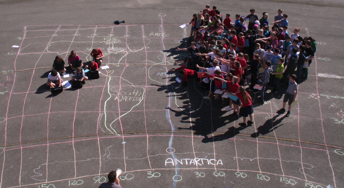
Stage 2 - World Village Population Numbers from 1810 to 2050 to show recent advances in population growth in Asia and Africa. Students had this information on the cards above and so simply calling the numbers out ensured that the students moved to the correct continent at the correct time. We are going to put together a time lapse video of this event to make the movements and changes more pronounced.
Stage 3 - World Village Disparities. I had the more straightforward task (still took 3 hours) of creating this set of cards that showed the global disparities using the information contained here on Pinterest. Again, there were 100 cards for each student showing a stage number and colour card. There were also a separate set of instructions for the students of what they should do when they were in position. 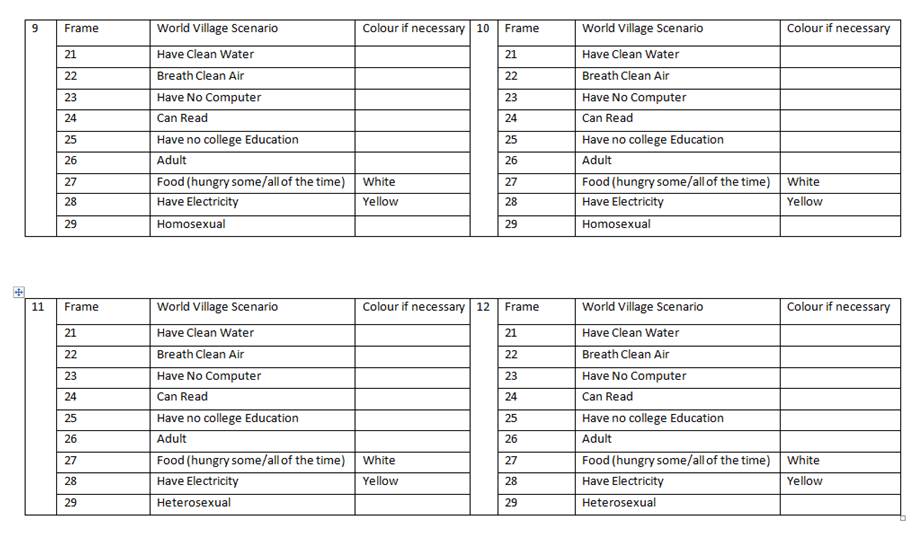
We have now got our time lapse video set up and I'll post it here when it is sorted and edited. We are going to hand these images over to the students now to use in conjunction with PhotoShop and GapMinder and see what we come up with in the lead up to the Gapminder visit next Monday. This time will give students the time to reflect on what they have been part of as due to time constraints, we couldn't explain scenarios as and when they were underway. They did pick up on the computer and college education disparity quite quickly though!!
5 Comments
Rene
5/7/2013 13:32:37
Great idea! Thx for the creative boost. I work with gapminder too
great ideas Matt, have down something a little similar but not as detailed and it works really well especially as you can see the interactions between pupils especially if you give them a dictaphone type device. Will send you some stuff. Btw have webinar tomorrow on webinar if your interested at 4.30pm uk time or 10pm . 5/8/2013 03:07:34
Fantastic work! Really creative practical exercise that will 'stick' with the students, and give real power to the follow up work in the classroom. Another great idea to steal! Would love copies of resources used!
Paula Owens
5/8/2013 20:03:18
Inspiring work! Love the practical engagement and great as a transition project too.
Peter Farárik
2/11/2014 14:58:17
Marvelous idea and activity! I would like to thank you for all the site content. It is really inspirational. Greetings from Slovak geography teacher :) Leave a Reply. |
AuthorAuthor of geographypods.com. Archives
May 2018
Categories
All
|


 RSS Feed
All content copyright geographypods unless otherwise stated.

|
|